Human-centered control solutions for industry, all from a single source: UX design, software, and consulting.
Our Services

UX Design methods & tools
UI Design
Industrial Design
Service Design
Facelifting & Redesign

Requirement Engineering
HMI application development
Custom software
Ongoing support

Tech Scouting
Market Research
UX Consulting
UX Maturity Check Service

HMI Software
Web
Java
Mobile Apps
Training
Tasks
Support
Modules
Security
PLC Communication
Machine status indicators
Line recipes
Datalogger
SECS-Gem
Interfaces (MES)
Responsense®
Cooperative work
Mobile solutions
– Jürgen Wegscheider, Department Manager ALPMA GmbH
Customer voices
„Alphagate supported us through a complete system change. The new operating concept was implemented with the Alphagate software platform A-Sphere / A-Vis. We now have the desired flexibility for our cleanroom technology products and can respond well to customer requirements.“


„Although we have a system that is customized for us yet standardized in terms of UX and operating concept, we are fully able to meet the requirements of our customers and projects. For further developments, especially in functionality, of the standardized platform, we gladly rely on the expertise of the Alphagate team and the underlying standards. This provides us with solid quality, state-of-the-art approaches, and support in project contexts, thanks to our skilled partner at the most important interface for us.“


„As part of the redesign of TASKI products, Alphagate created a new logic and a fresh look for our interface. With this HMI, even untrained users can quickly start up our products.“


„With Alphagate's software solution, we can run our HMI—wireless remote control—even on very lightweight hardware. Alphagate has been supporting us in its ongoing development for years.“


Project Highlights

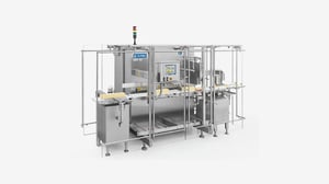
Food industry | UX/UI Design, HMI Software
See project
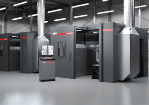
Surface solutions | UX/UI Design, HMI Software
See project
Laser welding systems | UX/UI Design, Software
See project
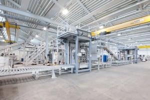
Food industry | UX/UI Design, HMI Software
See project