How is XR designed? Focus on graphical user interfaces
A blog series to introduce the topic of digital expansion of reality.
In the first post of our blog series “The Edge of Reality” we got to know the various “Extended Reality” (XR) technologies and variants. One or the other may have already had initial ideas about what could be implemented with XR technologies. But what do we have to pay attention to when implementing XR applications?
Graphical user interfaces in XR & MR
For the presentation of XR applications via tablets and smartphones, already known tools can be used for the design. This is not the case when designing holographic applications.
Designing for MR is an independent experience and requires different ways of thinking, such as the design of user interfaces for so-called “on-screen” applications. But how do we design graphic interfaces for MR?
Microsoft itself claims that mixed reality applications are unique and that it is therefore hard work to design and implement good MR experiences. The key to success here is clearly extensive test loops and iterations in the design and development phase. Such iteration loops also result in empirical values that must be taken into account when designing graphical user interfaces for MR applications.
Logic takes you from A to Z. Imagination takes you everywhere ”
Albert Einstein.
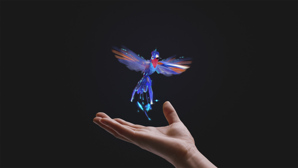
Before it comes to designing MR experiences and holograms: what is a hologram?
A hologram is a technical projection of an object that seems to float completely free in space. You can move around the projection and view it from all sides.
Aspects in the design of XR applications
Since holograms are displayed in connection with three-dimensional space, they require completely different UX/UI considerations such as on-screen applications and thus represent an absolutely new challenge for UX/UI designers.
The placement of the interface elements and their size in the room must be carefully considered in order to be perceived as “natural” by the viewer. When using transparencies and colors, attention should be paid to the positioning in space of holographic UI elements so that the elements do not get lost in the setting.
The application of colors
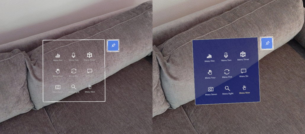
The use of color is one of the important components to consider when designing MR applications. Because holograms consist of light, they are based on an additive color representation. This means that white areas reflect the most light and are therefore the brightest. Black areas, on the other hand, do not receive any light and are rendered transparently on data glasses. That means something like that everything black becomes invisible.
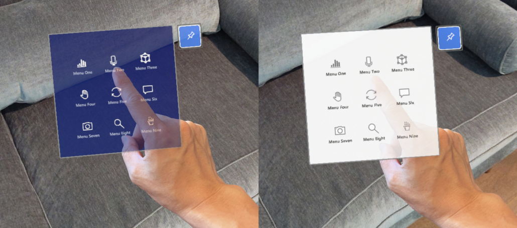
Nevertheless, we should be careful when dealing with white areas. Pure white should be avoided for large areas. Bright colors on large surfaces dazzle and tire our eyes. Therefore, a light gray should be used for light surfaces. The use of dark colors is generally recommended for larger areas and backgrounds. For the human eye, these are more natural and pleasant to look at.
If holograms are to be placed in particularly lively and messy environments, such as in a production hall, light colors should be used for important elements in order to maintain the contrast in different lighting situations. White text on a dark background does a better job than black text on a white background.
Colors are shown slightly transparently in holograms and look less lively and powerful in the usage environment than in design drafts on the PC screen. Nevertheless, the use, especially of signal colors, should be carefully considered and used in the sense of communicating the necessary information.
Copyright: Microsoft
When creating dark backgrounds, it must be noted that black areas in holograms are displayed transparently.
Copyright: Microsoft
Typography and holographic UI
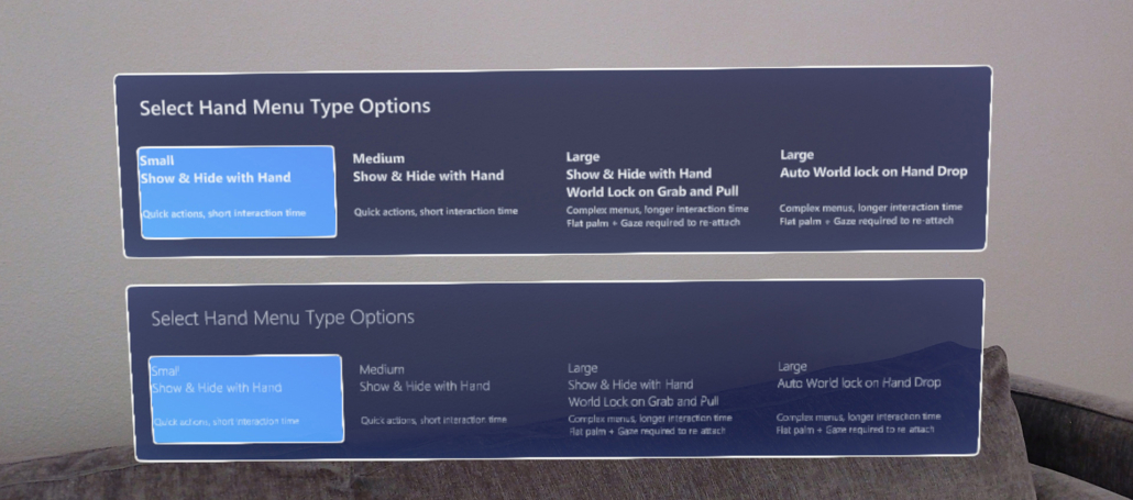
The same rules apply to the use of writing in MR applications as in all other areas of design. Text in both the physical and virtual world must be legible. Microsoft recommends avoiding the font styles “light” and “semi-light” for font sizes below 42pt, as the vertical lines of the font would be too thin, which would lead to flickering of the font and this, in turn, would impair legibility.
Copyright: Microsoft
Animations in XR – an almost necessary must
At XR, animations are more than just a nice feature to use. With the help of small and meaningful animations, information about the behavior of control elements can be communicated or used to draw the user’s attention to the essentials. For example, a control element outside the field of vision can be pointed out, the opening and closing of menu items can be provided with small animations or the status of activated elements can be communicated in a more understandable manner.
As we can see, creating 3D experiences is much more than just graphic design. It combines the different disciplines of UX design and in addition to creating graphics, it appeals to know-how from the areas of storytelling, product design, sound design, and stage design.
Outlook – you can read that in the next part:
In this second part of our blog series, we focused on graphical interfaces and what needs to be considered when designing them. In the next part of our blog series “The Edge of Reality,” we dive into the topics of storytelling, UX, and ergonomics.
This article was written by
Katerina Sedlackova UX/UI Design
April 8, 2021


