How is XR designed? Focus on graphical user interfaces
The bigger picture of reality – how is XR designed?
User experience and ergonomics in virtual design
In the last post of our blog series “The Edge of Reality,” we focused on the design of graphic elements and user interfaces. In this part of the blog series, we take a closer look at designing the overall experience of an XR application. On-boarding, storytelling, and ergonomic aspects play an essential role.
“One of the biggest challenges of AR compared to traditional
2D demonstrations is the creators’ inability to control the camera ”.
Michael Flarup, Danish game designer & entrepreneur
Change of perspective
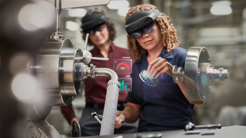
Probably the biggest difference between XR applications and 2D screen applications is the change from the observer’s point of view to the “first-person perspective”. This gives the user part of the control over the display of objects – this makes the design of virtual experiences interesting for users and designers, but also a challenge for the designer. Above all, we should not forget that in particular hologram technologies and applications are still unknown to a large part of the population and a simple explanation of the handling is necessary. Therefore, before designing XR applications, we should be aware of a few points:
1) What is the purpose of the application?
2) What has to be done (by the user) to achieve this goal?
3) What shouldn’t happen and what problems can arise?
4) What are the non-goals of the application?
Once these questions are defined, we can start looking at how we can achieve these goals and how we can ensure that the user doesn’t get lost in the application.
On-boarding, storytelling, and orientation for XR applications.
Orientation is a key issue in XR applications. This starts with the onboarding process. The user should be explained as simply and quickly as possible how the technologies are to be used, which tasks he or she has to solve, and how the XR application will help with the task solution. It is just as important in this first step explaining to the user how to navigate through the application, i.e. which gestures are to be used and whether voice commands are available.
With regard to orientation in the work process itself, there should be a stringent concept that accompanies the user through tasks and provides information on where the next work step is to be carried out. Small micro-animations can be very helpful here. They help to explain the handling and work steps, to give hints as to where the tasks are and whether the action of the user was successful or not. In XR applications, animations are much more than just a nice feature. They give the application a playful touch and the necessary orientation in the dynamic environment of physical reality.
Ergonomics in the design of XR
When combining virtual elements with the real world, a few guidelines must be adhered to so that they also feel “natural” to the viewer. The viewer’s field of vision and focus area play an important role.
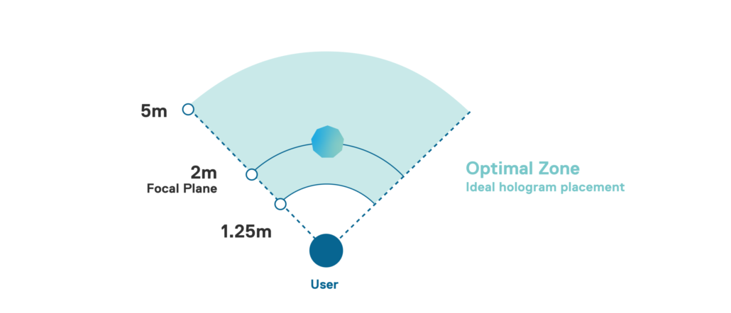
Holograms only feel “real” if their position is also integrated into the natural field of view. With a Microsoft HoloLens, for example, the optimal position of holograms should be within a 2-meter focal plane. All virtual elements, which in turn are positioned closer to one meter, are perceived as annoying or unpleasant by the viewer.
Ergonomics also becomes an issue when it comes to the design of gesture control and its use in the XR application. With the further development of technologies, the range of gestures that can be used is increasing, but unfortunately, there is also the risk of tiring the user prematurely with exaggerated gestures.
The extensive use of gestures, which we know from films such as “Minority Report”, is far too strenuous in practice for the real user in the long run. Smaller movements often result in a better experience. The higher the user has to raise their arm to perform an interaction, the faster that interaction should be to avoid fatigue. In particular, movements in which the elbow loses contact with the body should not be used too often or one after the other, as these lead to fatigue particularly quickly.
Ergonomics also in terms of information density
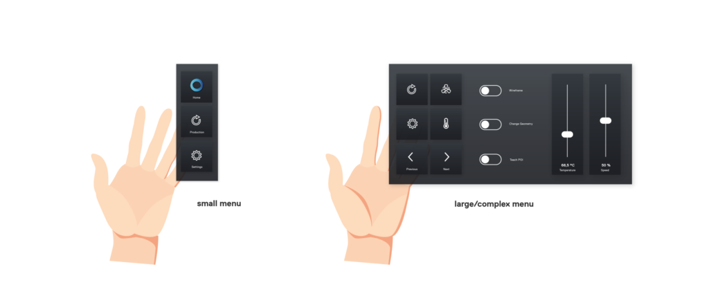
Films like “Iron Man” are not particularly recommended as sources of inspiration for industrial user interfaces. Complex buttons look quite spectacular in films, in practice, they would overwhelm the user when completing tasks. When designing the controls, we should help users focus on what really matters. A simple menu structure and simple representation of the controls serve this purpose best. Here, too, we follow the same approach as when designing on-screen applications – reduction to the essentials.
A preview of the next episodes
With the first three parts of the blog series “The Edge of Reality,” we have given you an overview of existing technologies as well as initial practical tips for designing XR applications. In the following two parts we dive into practical examples of the application of XR technologies in the industry.
This article was written by
Katerina Sedlackova UX/UI Design
May 25, 2021

